MakieCon 2023 was amazing!
Introduction
This week I participated in MakieCon 2023. The conference was devoted to Makie, which is a data visualization ecosystem for the Julia programming language, with high performance and extensibility.
The things you already can do with Makie are mind blowing, including 2D and 3D plots, animations, dashboards and more. If you want to see some showcases check out the Beautiful Makie website.
Today I want to write about AlgebraOfGraphics.jl package defines a language for data visualization, that is especially useful with tabular data.
It is natural to compare AlgebraOfGraphics.jl to ggplot2 as indeed both ecosystems allow to declaratively create graphics. In this post I want to highlight one important difference. The ggplot2 is designed to be a stand alone ecosystem. While AlgebraOfGraphics.jl is an addition to Makie.jl that makes standard tabular data visualization easy. However, you still can apply all low-level operations that Makie.jl provides to the created plots. Therefore you get the best of both worlds:
- a convenient declarative system for defining plots;
- ability of easy modification of generated plots to tune them to the exact needs of a data scientist.
I want to show you how this is achieved by example.
The post was written under Julia 1.9.0-rc1, AlgebraOfGraphics v0.6.14, CSV v0.10.9, CairoMakie v0.10.4, and DataFrames v1.5.0.
Setting up the scene
We will want to plot the following data stored in CSV format:
aog_csv = """
problem,language,time,size
binary-trees,Java,1.5886075949367087,1.0321384425216316
binary-trees,Julia,4.6075949367088604,0.7836835599505563
binary-trees,Python,28.29113924050633,0.8158220024721878
fannkuch-redux,Java,1.3825857519788918,1.408791208791209
fannkuch-redux,Julia,1.0329815303430079,1.1725274725274726
fannkuch-redux,Python,45.04617414248021,1.043956043956044
fasta,Java,1.5384615384615383,1.7382091592617908
fasta,Julia,1.4487179487179485,0.7395762132604238
fasta,Python,47.30769230769231,1.330827067669173
k-nucleotide,Java,1.2196969696969697,1.203187250996016
k-nucleotide,Julia,1.2474747474747476,0.6314741035856574
k-nucleotide,Python,11.694444444444445,1.3061088977423638
mandelbrot,Java,3.1538461538461533,0.7013215859030837
mandelbrot,Julia,1.0923076923076922,0.5453744493392071
mandelbrot,Python,136.4230769230769,0.6061674008810573
n-body,Java,3.1784037558685445,0.9118187385180649
n-body,Julia,1.9765258215962442,0.6803429271279853
n-body,Python,254.15023474178406,0.7323943661971831
pidigits,Java,1.4107142857142856,0.7009174311926606
pidigits,Julia,1.732142857142857,0.46422018348623856
pidigits,Python,2.071428571428571,0.5201834862385321
regex-redux,Java,6.675,0.6649964209019327
regex-redux,Julia,2.175,0.5433070866141733
regex-redux,Python,1.675,1.0042949176807445
reverse-complement,Java,3.829268292682927,1.110941475826972
reverse-complement,Julia,3.5121951219512195,0.26564885496183205
reverse-complement,Python,16.146341463414636,0.41424936386768446
spectral norm,Java,3.780487804878049,0.631578947368421
spectral norm,Julia,2.707317073170732,0.3583959899749373
spectral norm,Python,275.5365853658537,0.34001670843776105
"""
The CSV stores information on speed and code size of programs written in Java, Julia, and Python relative to C for ten selected computational problems. The data was taken from The Computer Language Benchmarks Game website. I discuss the interpretation of this data in Chapter 1 of Julia for Data Analysis book.
Let us first load this data to a data frame:
using AlgebraOfGraphics
using CairoMakie
using CSV
using DataFrames
aog_df = CSV.read(IOBuffer(aog_csv), DataFrame)
You should get the following output:
30×4 DataFrame
 Row │ problem             language  time       size
     │ String31            String7   Float64    Float64
─────┼───────────────────────────────────────────────────
   1 │ binary-trees        Java        1.58861  1.03214
   2 │ binary-trees        Julia       4.60759  0.783684
   3 │ binary-trees        Python     28.2911   0.815822
   4 │ fannkuch-redux      Java        1.38259  1.40879
   5 │ fannkuch-redux      Julia       1.03298  1.17253
   6 │ fannkuch-redux      Python     45.0462   1.04396
   7 │ fasta               Java        1.53846  1.73821
   8 │ fasta               Julia       1.44872  0.739576
   9 │ fasta               Python     47.3077   1.33083
  10 │ k-nucleotide        Java        1.2197   1.20319
  11 │ k-nucleotide        Julia       1.24747  0.631474
  12 │ k-nucleotide        Python     11.6944   1.30611
  13 │ mandelbrot          Java        3.15385  0.701322
  14 │ mandelbrot          Julia       1.09231  0.545374
  15 │ mandelbrot          Python    136.423    0.606167
  16 │ n-body              Java        3.1784   0.911819
  17 │ n-body              Julia       1.97653  0.680343
  18 │ n-body              Python    254.15     0.732394
  19 │ pidigits            Java        1.41071  0.700917
  20 │ pidigits            Julia       1.73214  0.46422
  21 │ pidigits            Python      2.07143  0.520183
  22 │ regex-redux         Java        6.675    0.664996
  23 │ regex-redux         Julia       2.175    0.543307
  24 │ regex-redux         Python      1.675    1.00429
  25 │ reverse-complement  Java        3.82927  1.11094
  26 │ reverse-complement  Julia       3.5122   0.265649
  27 │ reverse-complement  Python     16.1463   0.414249
  28 │ spectral norm       Java        3.78049  0.631579
  29 │ spectral norm       Julia       2.70732  0.358396
  30 │ spectral norm       Python    275.537    0.340017
Drawing a plot
Start with a complete code producing the plot:
fig = Figure(resolution = (900, 600))
aog_plt = data(aog_df) *
          mapping(:problem, [:time, :size];
                  marker=:language,
                  color=:language,
                  col = dims(1) => renamer(["", ""])) *
          visual(Scatter; markersize=15, strokewidth=1)
grid = draw!(fig, aog_plt,
             axis=(; xticklabelrotation=pi/6),
             palettes=(; marker=[:rect, :circle, :diamond],
                       color=["lightgray", "gold", "lightblue"]))
grid[1].axis.yscale = log10
hlines!(grid[1].axis, 1.0; color="red")
hlines!(grid[2].axis, 1.0; color="red")
lg = AlgebraOfGraphics.compute_legend(grid)
push!(lg[1][1], [LineElement(color="red")])
push!(lg[2][1], "C")
Legend(fig[1, end+1], lg...)
fig
It produces the following figure:
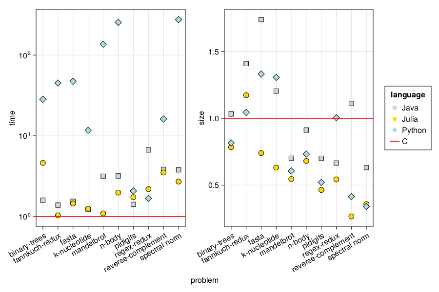
On the figure we can see that Julia performs quite well in both time and code size in comparison to other programming languages.
However, today I want to focus on plotting.
The first thing is displaying the plot.
If you use Jupyter Notebook or VS Code the plot will be just shown.
However, if you work in the terminal automatic displaying is turned
off by default. You need to run the Makie.inline!(false) command
to turn it on. After issuing it each time you try to display the
figure it will be opened in your default image viewer.
Now let me comment on the plotting code. If you have never used AlgebraOfGraphics.jl I recommend you first read the AlgebraOfGraphics.jl manual as the code I used is relatively advanced.
The line creating the aog_plt object is using AlgebraOfGraphics.jl
commands. As you can see using * we can link data, with mapping operations
and visualization commands. What is interesting in the presented case
is the fact that my source data contains two columns :time and :size
that I want plotted on separate subplots. This is not a problem in
AlgebraOfGraphics.jl. I just needed to pass a vector [:time, :size]
to make it work. Later the col = dims(1) => renamer(["", ""]) instruction
signals that I want to have them plotted in separate subplots. The
renamer(["", ""]) disables display of subplot titles as I have
series names shown as y-axis labels anyway.
Now notice the draw! command. It inserts the plot specification
created in AlgebraOfGraphics.jl into a Makie figure. The nice thing is
that it is possible to customize the plot by passing axis and palettes
keyword arguments.
The code that was really interesting for me comes next. The grid variable
is bound to a standard Makie object. Therefore I can later tweak as I wish
using Makie primitives. In this case what I wanted to do was:
- Changing the y-axis of the first of the plots to logarithmic scale.
I could easily achieve this by writing
grid[1].axis.yscale = log10. - Adding two custom horizontal lines (representing the reference C language)
to both plots which I achieved using the
hline!command. - Manually adding the C language entry to the legend of the plot which
I achieved by manipulating the
lgobject.
What is important is that even for someone who is not a Makie expert it was possible to work out how the underlying objects should be mutated to get what I wanted without a significant effort.
Of course one might want AlgebraOfGraphics.jl to be a complete plotting system like ggplot2. However, I think that the choice made in it is correct. I appreciate that the API of AlgebraOfGraphics.jl is relatively small. In this way you can easily learn to do simple and standard things. It also means that is is convenient to do exploratory data analysis (when you often need to do a lot of simple plots). Later, if I am to prepare a publication quality plot in which I need to perform some non-standard customizations I can use the Makie functionality to achieve this.
Conclusions
Here are the key things I learned during MakieCon 2023:
- Makie ecosystem provides a lot of advanced functionalities that are hard to find in other plotting packages. I typically need to prepare high-quality plots for publications. In this aspect a particular value of Makie is that it allows you to tweak every detail of the plot the way you want.
- AlgebraOfGraphics.jl is not an equivalent of ggplot2 (which is a complete stand-alone plotting system). I find it easier to think about AlgebraOfGraphics.jl as a set of extra functions that build on top of Makie and provide a convenient way to create visualizations of tabular data. However, you can later fall-back to Makie primitives to further customize the plots if needed.
Additionally, if you want to start working with Makie ecosystem you need to know that:
- It is essential that you read the Makie tutorial first.
To ensure the full flexibility of how your plots are styled Makie.jl introduces
several concepts (like
FigureorAxisobjects) that you need to learn if you want to confidently work with it. - Makie ecosystem provides several plotting backends that differ in functionality.
I use CairoMakie.jl as I typically need non-interactive 2D plots that have
publication quality. As a particular thing in this case you need to know
that if you are working in a terminal you need to use the
Makie.inline!(false)command to turn-on automatic rendering of a plot (this is not needed in Jupyter Notebook and VS Code) if you want it (alternatively you can explicitly save your plot to a file).
Before I finish I would like to thank Dr. Lazaro Alonso Silva for inviting me to the event. The conference was an exceptional experience. Makie community is amazing and full of brilliant members.
I also appreciate a lot the help from Pietro Vertechi and Fabian Greimel that gave me many useful hints about how to get the most out of AlgebraOfGraphics.jl.