ABC of Plots.jl
Introduction
Visualization is an important part of any data analysis project. When I started preparing my Julia for Data Analysis book I had to choose which plotting framework to use in it.
The challenge was that there are many great plotting packages in the Julia ecosystem. Let me mention a few here:
- Gadfly.jl will be appealing for ggplot2 users;
- Makie.jl is extremely flexible and performant; I especially appreciate how nicely you can create 3D animations using it;
- Unicode.jl can be used if you want the plots to be directly displayed in the terminal.
In the end I decided to use Plots.jl. The reason is that it is, in my opinion, easy to get started with while at the same time it is very mature and feature rich.
In this post I want to discuss my experience as a user of Plots.jl. This will be a simplified treatment of the topic. If you would like to learn more details I recommend you to visit the documentation of Plots.jl.
All the codes were run under Julia 1.7.2 and Plots.jl 1.31.1.
Getting started with Plots.jl
There are many plotting functions provided by Plots.jl. The ones that I use most frequently are:
plot: creates a new plot object;plot!: adds additional drawing to an existing plot;scatter: creates a new scatterplot;scatter!: adds a scatterplot to an existing plot.hline!: adds horizonal lines to an existing plot (there is alsohlinebut I do not use it much);vline!: adds vertical lines to an existing plot (similarly there isvline);heatmap: creates a new plot with a heatmap (similarly there isheatmap!);annotate!: adds annotation to an existing plot;savefig: save a plot to a file.
The fact that you have the ! versions of plotting functions is quite
convenient since it allows you to easily build your plot step-by-step by
interactively adding new elements to it.
The most important rule of Plots.jl is that almost everything in Plots.jl is done by specifying plot attributes passed as keyword arguments.
Let me list the basic attributes I use most often:
title: sets plot title;xlabel: x-axis label;ylabel: y-axis label;legend: legend position;labels: labels for a series that appear in the legend.
Having this knowledge create a simple plot to see all these elements in action:
julia> using Plots

julia> z = exp.(range(0, 2π, 65)im)
65-element Vector{ComplexF64}:
                1.0 + 0.0im
 0.9951847266721969 + 0.0980171403295606im
 0.9807852804032304 + 0.19509032201612825im
                    ⋮
 0.9807852804032303 - 0.19509032201612872im
 0.9951847266721969 - 0.0980171403295605im
                1.0 - 2.4492935982947064e-16im

julia> plot(z; title="Circle", legend=:bottomright, labels="z")

julia> scatter!(z; xlabel="Re", ylabel="Im", labels=nothing)

julia> savefig("plot1.png")
Which produces the following plot:
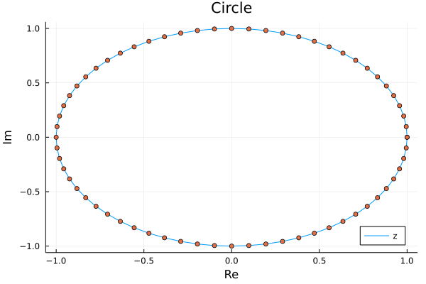
Note that Plots.jl nicely handles plotting a series of complex numbers.
The only problem with this figure is that it is not a circle. Let us fix it.
Some more parameters
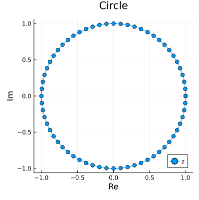
To make the plot be a circle we must set aspect ratio in it to be equal.
Additionally to make it look nice I adjust figure size to be square and I add
a marker option in plot command to get both the line and points in one go.
julia> plot(z; title="Circle", xlabel="Re", ylabel="Im", legend=:bottomright,
            labels="z", marker=:o, aspectratio=:equal, size=(400, 400))
We now have the following plot:
You might wonder where you can learn about various attributes that Plots.jl allows for. Fortunately there is a section on attributes in the documentation which allows you to browse through many available options.
Common challenges when using Plots.jl
There are two types of common challenges people often encounter when using Plots.jl. The first is that is when you plot n series with a single plot command you need to pass a 1xn matrix to of attributes that apply to each of the series (users often incorrectly pass a vector). The second is that sometimes text printed on a plot gets cropped and you need to adjust padding to fix this problem. Let us investigate these issues one by one.
Start with the issue of multiple series in a single plot.
julia> plot([sin cos]; labels=["sin" "cos"], color=["red" "black"])
Which gives us:
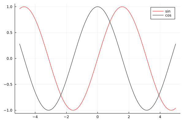
First note that plot nicely plotted functions that we passed to it. The
key thing to get this plot right was to pass all arguments as 1x2 matrices
therefore in array literals I just used a space (without a comma).
Now let us discuss padding. In this example I additionally show you how to set custom ticks in a plot.
julia> sales = [1, 5, 2, 7];

julia> plot(["winter", "spring", "summer", "autumn"], sales;
            labels=nothing, tickfontsize=10, xrot=90,
            yticks=(sales, 1000sales),
            ylim=extrema(sales) .+ (-1, 1),
            bottommargin=5Plots.mm)
The command above produces this plot:
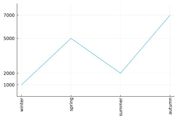
I think that most of the passed keyword arguments have self explanatory names.
Let me comment on two things. In yticks=(sales, 1000sales) the first element
of the tuple are tick locations and the second are tick labels (in this case I
assumed that the original sales vector represented sales data in thousands).
Because x-ticks in our plot were long I needed to rotate them. However, after
rotation they get cropped. Therefore I had to add extra padding at the bottom
with bottommargin=5Plots.mm. The Plots.mm part makes sure that the padding
is measured in absolute terms (5 millimeters in this case). When setting the
margins in Plots.jl you have to pass absolute length measures. They are defined
in Measures.jl and internally imported, but not re-exported, by Plots.jl.
Conclusions
I hope that this post will be useful for new Plots.jl users and help them avoid challenges that they might to have when using this package.